Trends
inspire me

Pantone Colour of the Year: Living coral

Global colour gurus, Pantone, have announced ‘Living Coral’ as its Colour of the Year 2019. We will show you how to get the buzz with this energetic, orange hue.

Pantone Colour

What is Living Coral?

It’s been described as an ‘animating and life-affirming shade of orange with a golden undertone’. Translated, that’s a bold, reddish orange with a feel-good glow. Bright yet warm and perfect for a splash of much-needed colour in our homes (and perhaps a little easier on the eye than last year’s sassy, space-age Ultra Violet).

Tip: If you like the look of PANTONE 16-1546 Living Coral try Graham & Brown’s ‘Watermelon’ and Dulux’s ‘Coral Flair’.


Pantone Colour

Why this colour now?

Well, we could all do with a seasonal pick-me-up, right? And Living Coral will certainly give your home a spirited boost, wherever you choose to use it. It has a warm, comforting ambience, inspired by coral reefs and the energy of nature. Not loud and brash, like this year’s throwback neons, but playful, spirited and nurturing.

Tip: Steer clear of bold, OTT oranges and reds, for fear of a dated 90s vibe. Instead, bring the look bang up to date, by pairing with soft aqua, grey, natural woods, even midnight blue.


Pantone Colour - bedroom

Where do I start?

Living Coral is guaranteed to cheer up any space. Use it as an accent colour in the lounge and bedroom with linen cushions, zig-zag prints and throws. It’s a game-changer shade against crisp white and looks incredible with a soft blue palette if you prefer a natural vibe. Don’t be afraid to try it out in the kitchen with storage jars and canisters or with plump coral towels and bath mats in the bathroom.

Tip: Darker walls are still good for 2019 and rich, deep greens and petrol blues come alive with a statement coral sofa or chair.


Pantone Colour - bathroom

What if I'm more into neutrals?

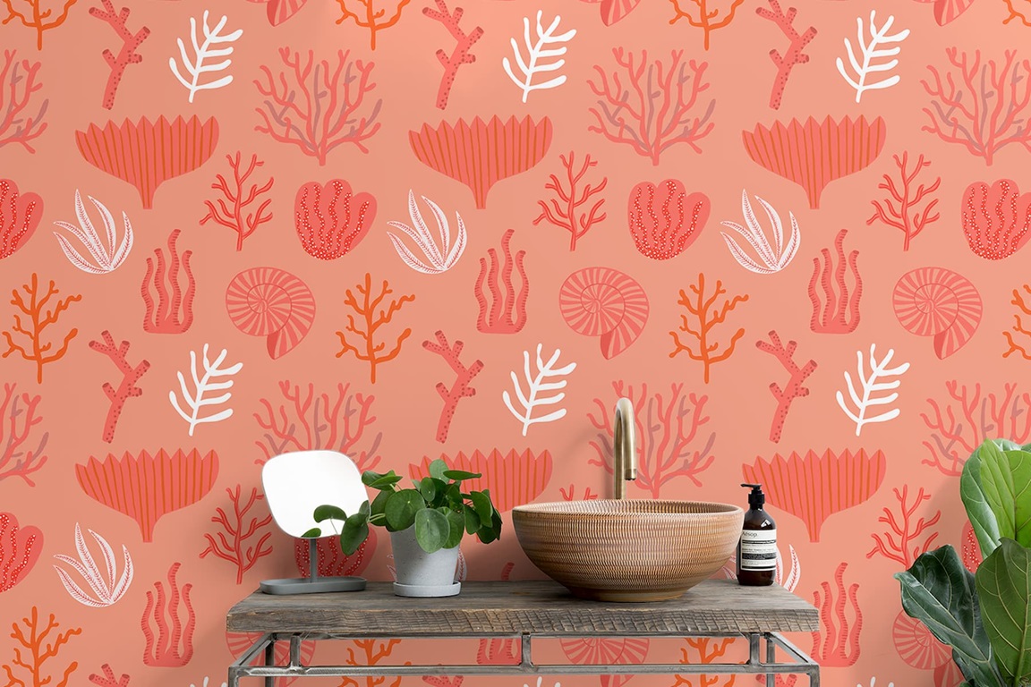
Dip your toe in the trend with upbeat coral accessories like block-colour cushions, a vibrant rug or even simply a bouquet of coral blooms. Take the tone down a notch with a more terracotta hue if you prefer, or use as part of a wallpaper pattern with neutrals like buttermilk, off-white and taupe. 

Tip: Not sure about coral? Spring is the perfect season to try out the trend with accessories that can be swapped in and out if you change your mind. 


Albion Lock, Sandbach - Alton-G - Dining